
Paint Match Library
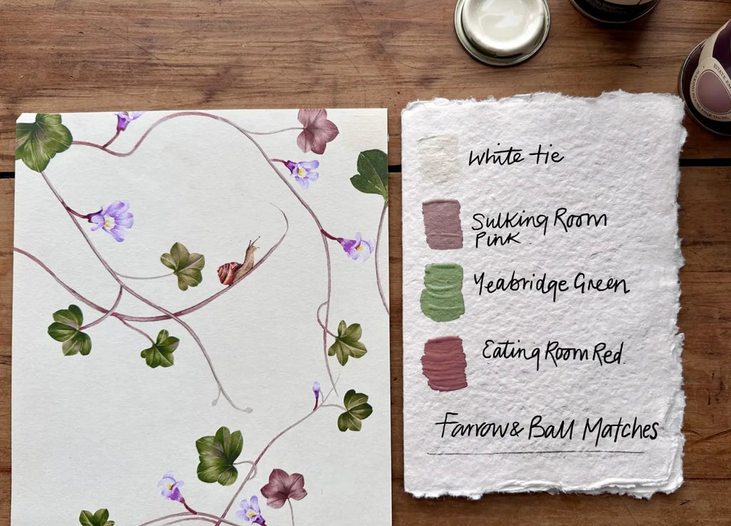
Creeping Toadflax colour matches by paint brand
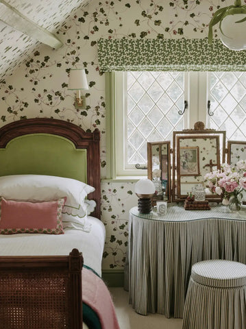
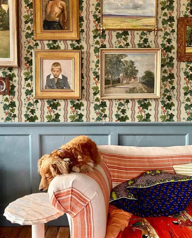
Photo Credit - Emma Ainscough.
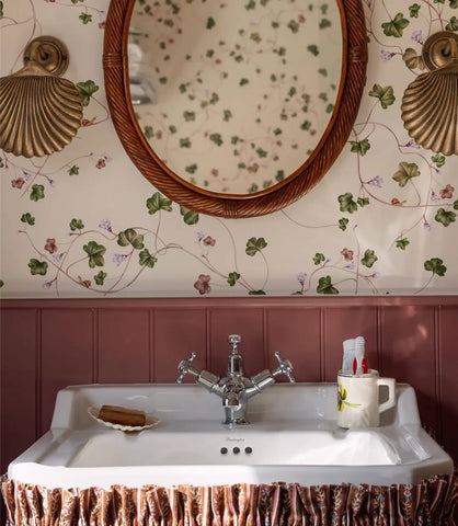
Photo Credit - Louise Roe
Farrow and Ball
White tie is perfect for a base neutral tone. Yeabridge Green is a good tonal match to the green in the Toadflax leaves. Eating Room Red is a great strong red to tie in with the red stems and leaves. Then to finish, Sulking Room Pink is a great softer choice if you want bring in a pinky/red tone to the room.
Paint and Paper Library
Paarl is a near perfect colour match to the base colour of the Creeping Toadflax paper. Chelsea Green II and Euphorbia are both great choices for a tonal green match. Trilogy is a bold red to use on woodwork as an accent colour, not for the faint hearted. If you're feeling a bit more in need of a neutral tone then Desert Rose is a great pinky tone to match the stems within the Toadflax stems.
Little Green Company
First light is again, an almost near perfect base colour match for your base colour. Little Green has a great selection of greens to choose from for a Toadflax colour match. But our favourites are Boxington and Citrine. For a red tone, Tuscan red, matches quite well to the red within the design, but Dorchester Pink is a favourite of ours for matching the stems and flowers within the pattern.
Edward Bulmer
Fair white is a great colour match for the base white tone. Then for green tones Royal Grass Green and Pippin are our favourites. Although there is so many to chose from! Edward Bulmer does green so well. For your red tone, Louise Rose famously used Pompadour on the woodwork when matching it with the Creeping Toadflax paper, in her daughters bathroom. Lavender is also a beautiful colour to match back to the flowers and stems within the design, and a colour we have seen used on woodwork with this design in a cloakroom.
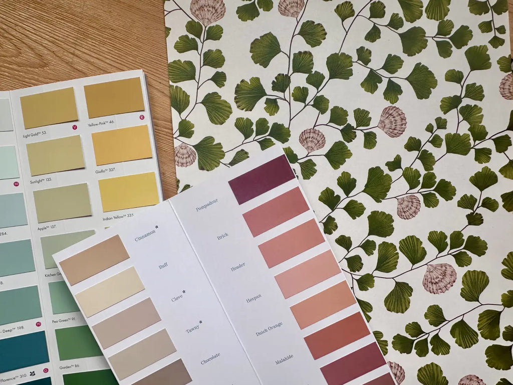
Maidenhair Colour matches by paint brand:

Farrow and Ball
White tie is the best white match for Maidenhair, as it has a creamy undertone that works really well. Bancha is the best green colour pairing, and the iconic Setting Plaster is a perfect match for the shell details. Dead Salmon is also a pairing work mentioning for woodwork and the like.
Paint and Paper Library
Paarl is a great white match for the Maidenhair paper. Euphorbia is a nice green colour pairing, with its yellowy undertones, and Temple pink is a great colour to match back to the shells. Then for a bit of a bold touch Masai is a beautifully bold deep red colour combo to match with the darker detailing in the designs shells.
Little Green Company
Stock is a good base match for Maidenhair, with its slightly warmer undertone, whilst Light Olive Colour, Apple and Boxington work well for a green pairing. Masquerade and Beauvais Lilac are beautiful soft pinks to match back to the shells within the design, whilst if you're looking for something deeper, then Tuscan Red works well.
Edward Bulmer
Edward Bulmer has loads of great off white tones, but Whiting is the best colour match for the Maidenhair design. Whilst Royal Grass Green and Pippin work well for the green accents. One of my absolute favourite paint colours, and perfect for the Maidenhair pink pairing is Jonquil.
Old Oak colour matches by paint brand:
Farrow and Ball
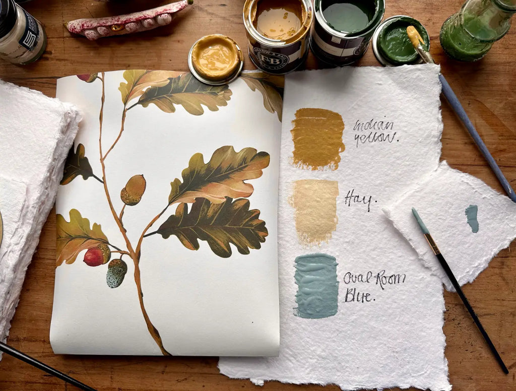
Lime White is a great base colour pairing for the Old Oak paper, with Eating Room Red matching the red acorns really well. The blue speckled eggs within the design are best matched with Oval Room Blue and Borrowed Light (for a lighter tone). Hay is a gorgeous warming colour, that sits really well with the browning leaves, and Churlish Green is also a favourite with this one. Not to forget, Indian Yellow for a gloriously deep yellow tone.
Paint and Paper Library
Leather 1 is a good base colour to match to the creamy base of this design, with Beetle Nut being a good deep red tone to match the acorns. There are two yellows we would suggest, both Muga and Rufus work well. The blue speckled egg is best matched with Sea Nor Sky with P&PL, and to throw in a green, we suggest Scallion.
Little Greene Company
Stock is a good base match for the Old Oak paper, with Celestial Blue being a good speckled egg pairing. As previously mentioned, Little Greene do green tones so well! so there are lots to chose from. Apple is a lovely pale green colour, which would work beautifully for woodwork, as well as Citrine for something a little more daring. But if you're after a dark green then Light Olive Colour is a good shout. Yellow works really well with the old Oak paper, and our favourites are Yellow-Pink and Light gold.
Edward Bulmer
Whiting is a fairly close match for the Old Oak's base white. Ethereal Blue is a beautiful blue in of itself, but it matches perfectly to the Speckled eggs within the print. Olympian green is a great yellowy green match to the leaves within the print, whilst Trumpington is a gorgeous golden brown/yellow tone perfect for woodwork or as an accent colour.
River colour matches by paint brand:
Farrow and Ball
Dimity is a great off white perfect to match to the base colour of the Rivers paper, with Preference Red being great as a bold accent red. De nimes is a beautiful blue pairing, matching back to the flowing rivers with the pattern, and Jitney is just a great neutral that pairs really well with the stoney colours within the design.
Paint and Paper Library
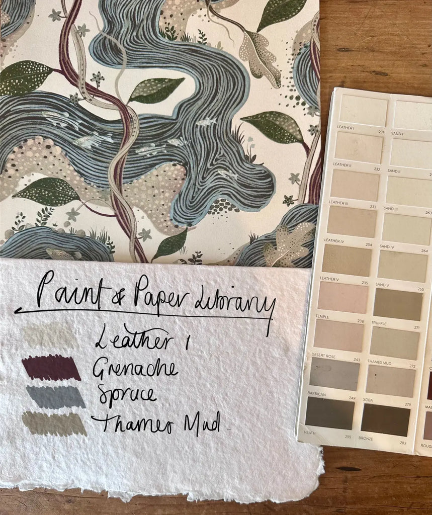
Leather 1 is a great off white for the Rivers paper, whilst Grenache is a gorgeous deep red to match the twisting vines within the print. Spruce is a great blue pairing with its slightly grey understone and Thames Mud (great name) is a great stoney ground colour for this one.
Edward Bulmer
Cerullian Blue is a great mid blue match with Edward Bulmer, or Indigo if you fancy something a bit darker. Pompadour is a great red pairing, whilst Tawny is a really nice mid brown/beige tone that warms up the feel of the design really well.
Little Greene
We struggled to find a great match for the white base from Little Greene with this design, but Silent White isn't too far away if you're dead set on using them for all your colours. Bath Stone is a great warm toned brown to pair with the Rivers pattern, it matches the pebbles in the design really well. Basalt is a very bold choice of dark blue, which matches the darker depth of the River beds in the print really well. Whilst our preferred colour pairing choice is Adventurer red. Its a perfect tone to match back to the vines, and its also just a great colour in its own right.
Inflorescence colour matches by paint brand
Farrow and Ball
Joa's White is a great off white base match. Whilst Green smoke is a great cool green to match back to the leaves and the lilacs of the flowers within the print. Sulking Room Pink is a beautiful feminine tone to pair Inflorescence with, it really brings out the softness of the flowers. Whilst Preference Red could work if you were looking for a more contrasting tone.
Paint and Paper Library
Leather II is a great off white pairing with the Inflorescence base colour. Whilst Plaster V and IV are both beautiful soft mauve pink/lilac tones for a feminine woodwork pairing. Greenback matches the leaves within the print really well and would give you a more classic botanical inspired pairing.
Little Greene
Clay Mid is a great base tone match, whilst Blush sits very well as a pink tone for woodwork etc. A safe bet for panelling would be Sage, as it is a very soft mid green that pairs back to the leaves in the print really well.
Edward Bulmer
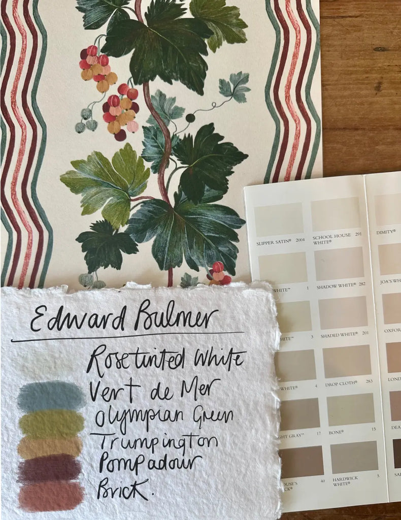
Rose tinted White, isn't a perfect match, but it is very close and complimentry as an off white pairing. Whilst Light Olive Green, Pompadour and Lavender all work really well as a a match.
Twisted Vine colour matches by paint brand
Farrow and Ball
Lime White is a great base tone match, whilst Red earth and Picture Gallery Red match really well to the red within the print. Indian yellow is a great colour for matching the yellow and would be perfect for fabric pairings and trims etc. But by far our favourite pairing is Oval Room Blue.
Paint and Paper Library
Leather 1 is a great off white base for Twisted Vine, whilst there are also great red, blue, yellow and green pairings in the following P&PL tones; Masai, Blue Gum, Muga and Stable Green.
Little Greene
Silent White Mid is a great base tone for matching back to an off white. whilst Tuscan Red is an earthy red to warm up the cool tones of the print, perfect for woodwork. Livid is an almost exact match to the blue stripe within the print and would equally work for woodwork or accent colour. Olive green is yet again a great match for this design, along with a lot of our others.
Edward Bulmer
Rose tinted White is the best Edward Bulmer off white match. Sang De Boeuf is a lovely earthy red to sit alongside Twisted vine, whilst Olympian Green is a, Saxony and Lute all add something a bit different and retro/lived in to the design.
Totem Paint Matches by brand:
Paint and Paper Library
For a beautiful and well-balanced palette, Paint and Paper Library offers some stunning options. Paarl serves as a great base colour, complemented by Masai, a rich deep red-brown tone, and Kigali, a striking deep navy blue. For a warm touch, Morning Room adds a golden yellow hue. Meanwhile,
Edward Bulmer
Edward Bulmer’s Milk White works wonderfully as a base, pairing seamlessly with Indigo for a deep blue accent. Trumpington brings a gorgeous golden yellow into the mix, while Pompadour offers a sophisticated burgundy red. For a softer, more neutral warmth, Cinnamon provides a subtle yellow undertone.
Sibylla Paint Matches by brand:
Paint and Paper Library
For a beautifully coordinated palette to complement this wallpaper, Paint & Paper Library’s Stone 1 makes a perfect base colour, while Powder I-V introduces a soft, neutral pink. For an unexpected yet striking contrast, Blue Gum adds a touch of blue, while Soumak picks up on the rich burgundy tones in the design. For the greens, Stable Green provides a deep, grounding shade, whereas Willow V offers a warm, neutral green ideal for woodwork.
Edward Bulmer
From Edward Bulmer, Rose Tinted White works wonderfully as a base, while Grab Green is a warm, inviting green, especially suited to north-facing rooms. For pink accents, Clove or Setting Plaster add warmth, while Saxony brings in a mid-blue that ties beautifully to the floral details in the wallpaper.
Large Scale Sibylla Paint Matches by brand:
Paint and Paper Library
To complement this wallpaper, Stone 1 from Paint & Paper Library serves as a perfect base colour, while Powder I-V introduces a soft, neutral pink that enhances the warmth of the design. For a bold contrast, Blue Gum offers an unexpected blue pairing, while Soumak beautifully matches the rich burgundy tones. When it comes to greens, Stable Green provides a deep, grounding shade, whereas Willow V offers a warm, neutral green, ideal for woodwork.
Edward Bulmer
From Edward Bulmer, Rose Tinted White is a lovely base match, while Grab Green adds a warm, earthy green—perfect for north-facing rooms. For subtle pink undertones, Clove or Setting Plaster work beautifully, while Saxony introduces a mid-blue that echoes the floral details in the wallpaper.
Still to come... Pelargonium and Milargros colour matches by paint brand.