
Charlotte's Folly by Emma Ainscough Design
We caught up with Emma Ainscough to discuss the extensive refurbishment of Charlotte's Folly - an old farm cottage dating back to the 1800s. We find out how they restored the magic into this enchanting holiday rental and the inspiration behind the enchanting design.
The interior scheme is delightful throughout the entire property. Were you working to a specific brief?
Thank you! As Charlotte’s Folly is a high-end holiday rental, the brief was to create something luxurious yet eye-catching, where the interiors were it’s main selling point, to urge people to want to visit to soak it all up for themselves. With the finished product being more of a short-term experience rather than a home, I pushed boundaries by designing bolder spaces, to create something that felt quite whimsical & exciting.
Where do you find inspiration for your designs and what inspired the design for the bedroom?
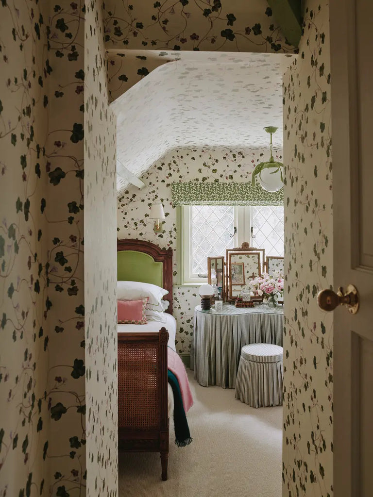
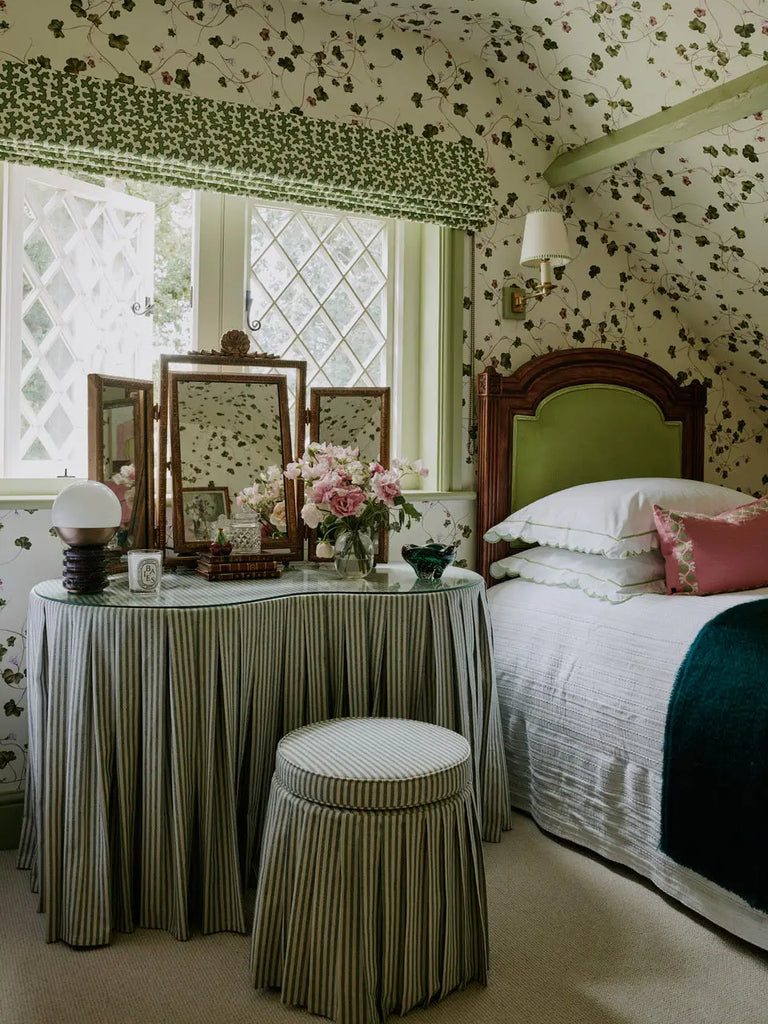
I often find inspiration from nature and the outdoors generally - in colour palettes and patterns, and for this bedroom particularly I took inspiration from the views out of the windows over the rambling countryside setting of the house. That bedroom was at the top of the house in the eaves with fantastic views, so I leant into that and created something which revolved around nature.
We are obviously huge fans of wallpaper! Why did you select our Creeping Toadflax for the bedroom?
The Creeping Toadflax was the perfect choice for the brief overall and also this bedroom in particular. Wallpapering in spaces with eaves & sloping ceilings is such a great way to make an impact, but ideally the wallpaper should be fairly non-directional in order to get the most out of it, otherwise the angles & joins become very obvious. Creeping Toadflax is just as beautiful any way up! And with the references to nature above, it felt like the perfect solution.
What advice would you give to others that want to experiment with colour and patterns in their interiors?
To go for it! Many of my clients love colour and pattern but are afraid of putting them together, but you can often sense check whether colours / patterns are going to work together by looking around you - drawing colours out from a piece of artwork or a favourite fabric and working from there. If the colours are being drawn out from something existing like an artwork, then chances are that they’ll all work well together as a room scheme overall.
To see more beautiful work by Emma Ainscough Design, visit their beautiful website here.